Local Activ Advisor for Kingston, Surbiton, Raynes Park, Wimbledon, New Malden, Worcester Park, Morden – SW London and Surrey area.

In today’s digital age, where consumers seamlessly transition between smartphones, tablets, laptops, and desktop computers, the importance of responsive web design cannot be overstated. Responsive web design is the practice of creating websites that dynamically adjust their layout and content to provide an optimal viewing experience across a wide range of devices and screen sizes.
Essentially, responsive web design ensures that your website not only looks visually appealing but also functions flawlessly, regardless of the device your visitors are using. Whether someone is browsing your site on a tiny smartphone screen during their morning commute or on a large desktop monitor in the comfort of their home office, responsive design ensures that they have a consistent and enjoyable experience.
At its core, responsive web design is about flexibility and adaptability. It’s about creating a digital space that can gracefully accommodate the diverse needs and preferences of your audience. By embracing responsive design principles, you can ensure that your website shines on any screen size, effectively engaging visitors and encouraging them to explore further. Ultimately, responsive web design is a cornerstone of modern digital strategy, enabling businesses to reach and connect with their audience in meaningful ways across all devices.
Your website is often the initial point of contact for potential customers, serving as the virtual storefront that welcomes them into your world. In this tech-savvy environment, where consumers have high expectations and an abundance of options at their fingertips, the importance of a well-designed website cannot be underestimated.
A well-designed website goes beyond mere aesthetics; it’s a reflection of your brand’s values, ethos, and commitment to excellence. From the moment visitors land on your site, they are forming opinions about your business – a poorly designed website can quickly turn them away, while a thoughtfully designed one can captivate their attention and leave a lasting impression.
Intuitive navigation is key to ensuring that visitors can effortlessly find what they’re looking for. Whether they’re seeking information about your products or services, browsing your portfolio, or looking to get in touch, your website should guide them seamlessly along their journey. Cluttered layouts and confusing navigation menus can frustrate users and drive them to seek alternatives elsewhere.
Eye-catching visuals play a crucial role in capturing attention and conveying your brand’s personality. Whether through striking imagery, engaging videos, or compelling graphics, your website should tell a visual story that resonates with your audience and sets you apart from the competition.
By prioritising user experience, aesthetics, and functionality, you can create a digital presence that not only attracts visitors but also converts them into loyal customers, driving the success of your business in the dynamic marketplace of Kingston.
Responsive web design is a multifaceted approach that encompasses several key elements to ensure an optimal user experience across various devices. Let’s delve deeper into these fundamental components:
Incorporating these key elements into responsive web design ensures that websites deliver a consistent, engaging, and user-friendly experience across a wide range of devices. By prioritising adaptability, readability, and performance, responsive design empowers businesses to reach and engage their audience effectively in today’s mobile-centric world.
Responsive web design presents a multitude of benefits, yet it also comes with its fair share of challenges. Here, we’ll delve into some common issues faced and explore effective solutions to overcome them:
Navigating the challenges inherent in responsive web design requires strategic planning, technical expertise, and a commitment to delivering exceptional user experiences. By addressing legacy system constraints and prioritising performance optimisation, businesses can unlock the full potential of responsive design and stay ahead in today’s competitive digital landscape. Contact us to see how we can help you at activ.
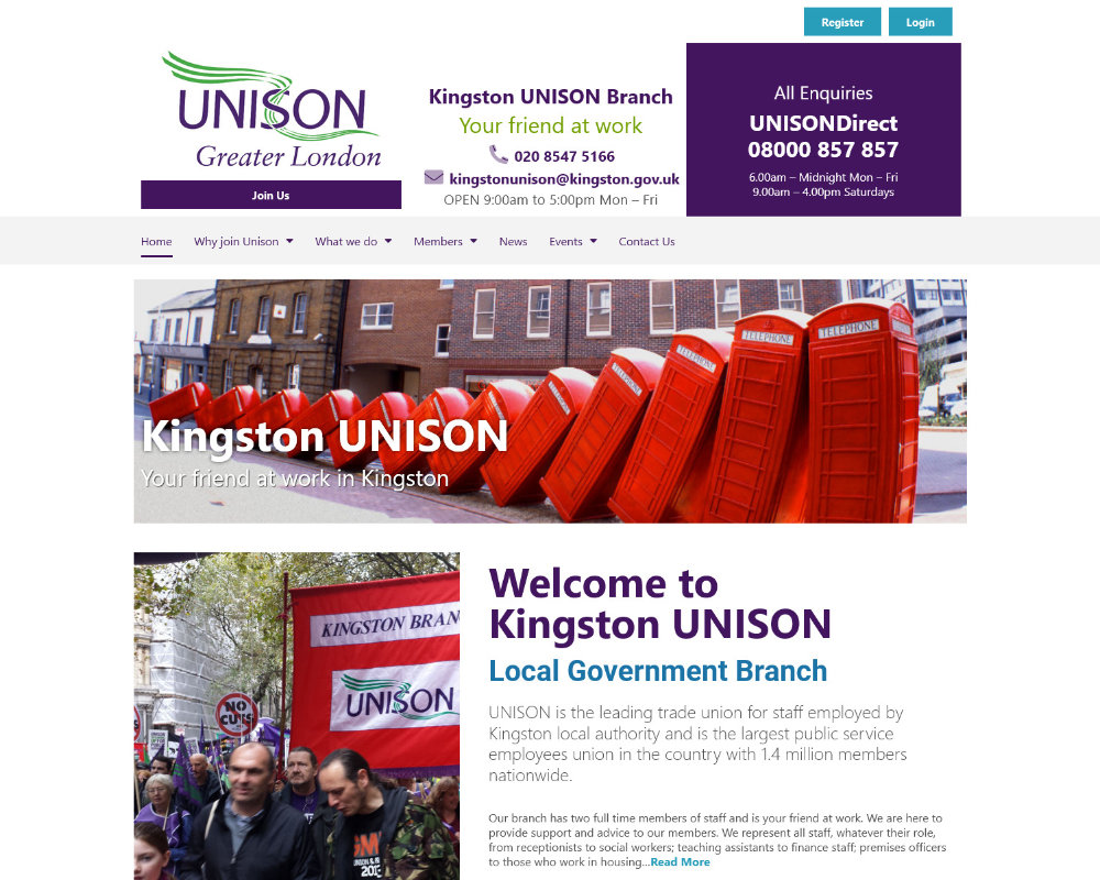
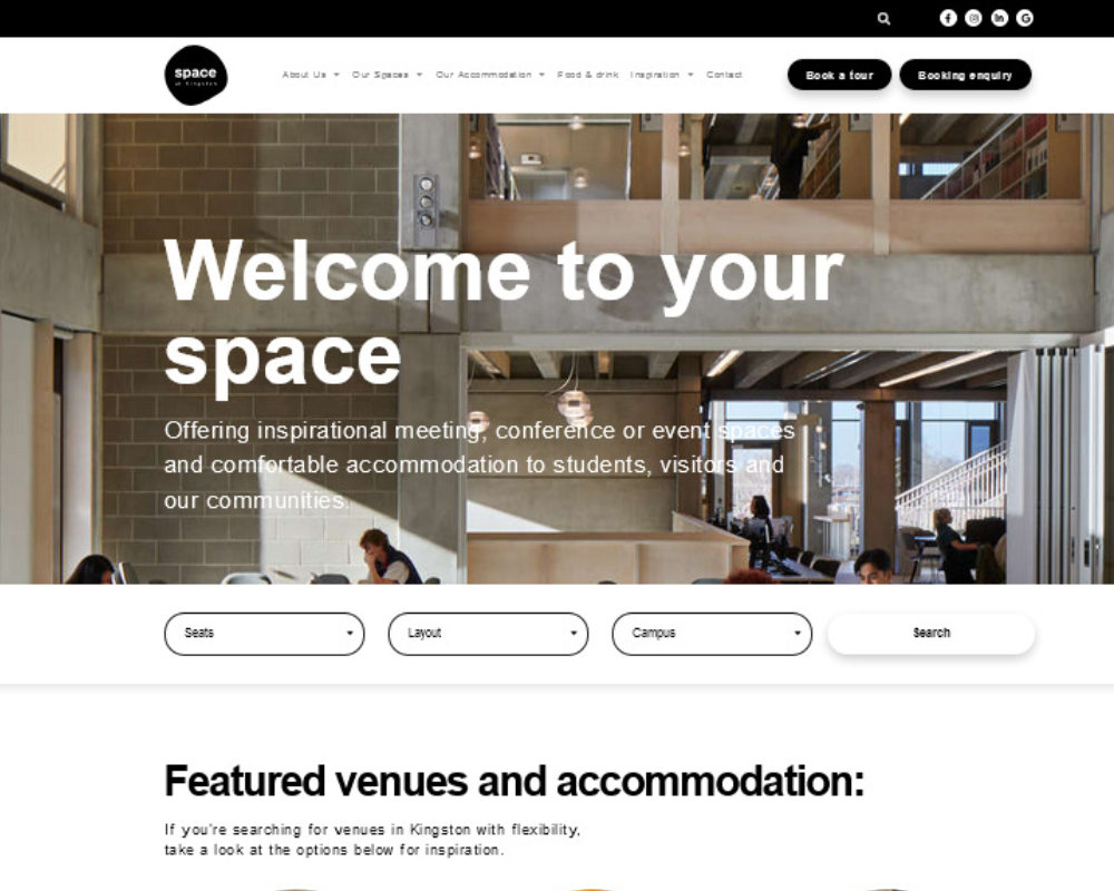
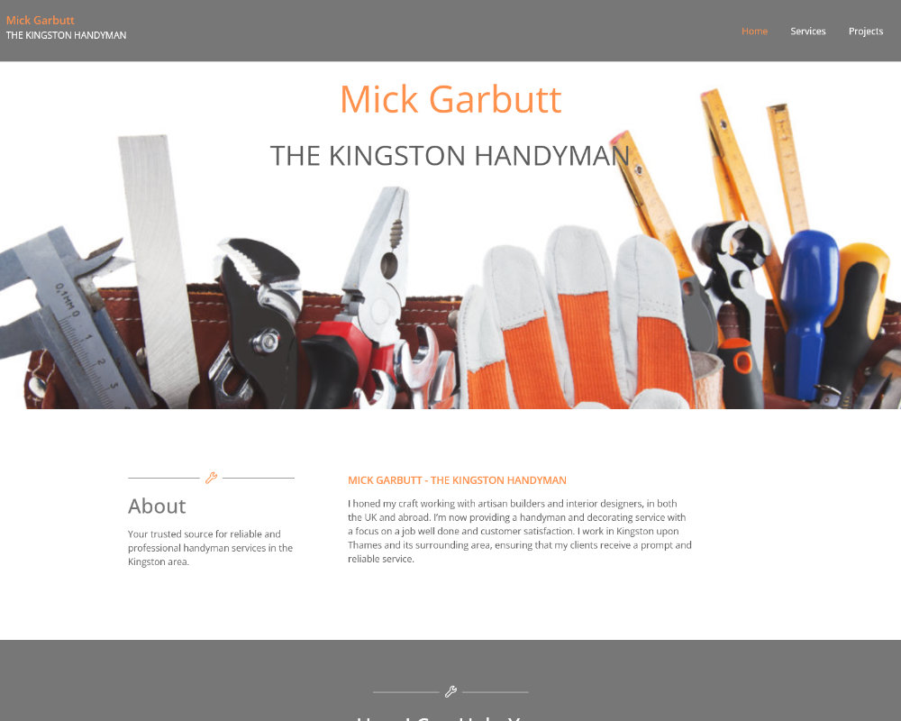
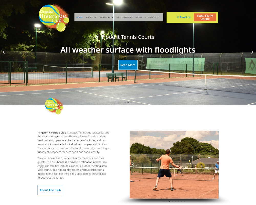
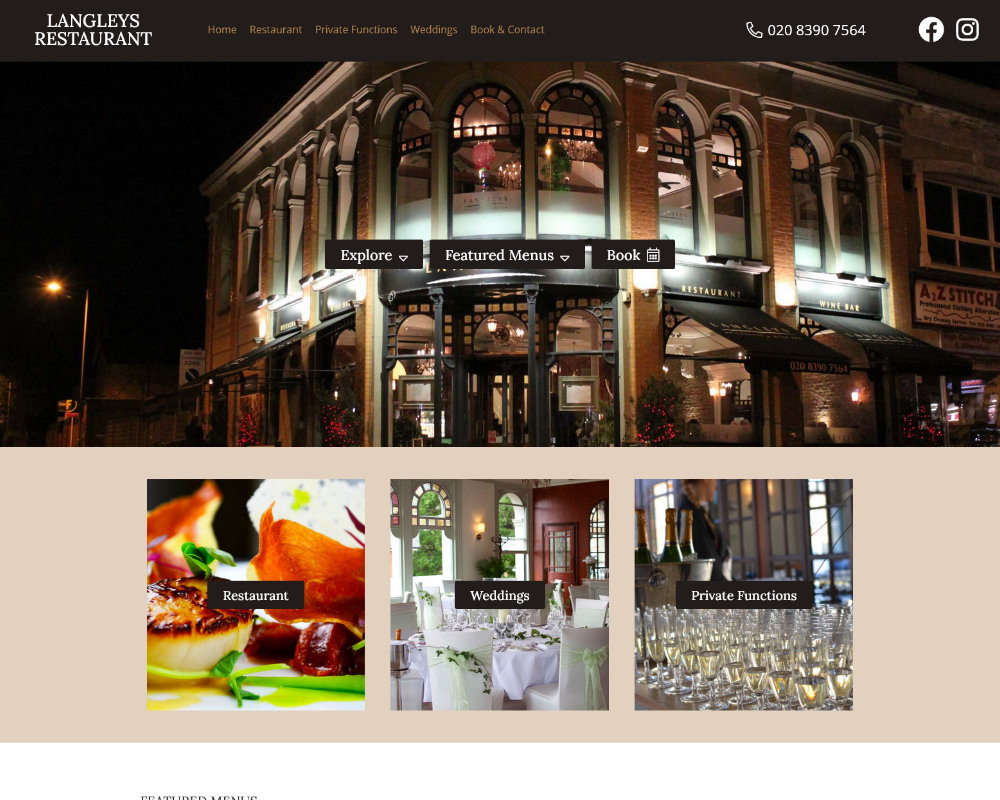
Explore our diverse portfolio showcasing successful web designs across various Kingston industries. From e-commerce sites to service-based businesses, our portfolio attests to our commitment to excellence and client satisfaction.
Client Success Stories
Read testimonials from satisfied Kingston clients, sharing their experiences and the transformative impact our tailored web designs have had on their businesses.
ExcellentBased on 47 reviews Trustindex verifies that the original source of the review is Google.
 Eloise Marshall2024-03-26Mark did a brilliant job helping me create my first website. He had great communication and efficiency, and he tailored my website to exactly what I wanted.Trustindex verifies that the original source of the review is Google.
 Dillon Marshall2023-10-05I asked mark if he would be able to completely sort out my website. After having a bad experience with other companies I was worried about making the investment again. Well I am over the moon, the site is amazing the service and communication throughout is fantastic. I would highly recommend!Trustindex verifies that the original source of the review is Google.
 Mick Garbutt2023-08-13I asked Mark to design a website for my new business. He was fast, efficint and the end product looks great. He was also able to host the site and get it live, all for a reasonable monthly cost.Trustindex verifies that the original source of the review is Google.
 Linda Penny2023-06-13I'm thrilled with my new website. Mark from Active was a pleasure to work with. He gave me excellent advice, is very knowledgeable and works in an easy and friendly way. For someone like me who is not tech savvy he was very patient! I would definitely recommend him.Trustindex verifies that the original source of the review is Google.
 Space Team2022-12-12Mark and the team at Activ Digital Marketing have been incredibly helpful and professional and have met all our needs in getting our new website and marketing plans launched. Thank you so much!!Trustindex verifies that the original source of the review is Google.
 Susie M2022-10-01Mark refreshed and updated my website. Did a first class job. It's now much easier for me to update content and will help me to market my business more effectively. Definitely recommend.Trustindex verifies that the original source of the review is Google.
 Helen Kirkby2022-09-30Mark from Active has been brilliant! The process of creating a website is daunting, but Mark skillfully led me through the process with lots of great advice and a speedy service. He know manages my site and it's great to have the peace of mind that he's on hand if I need help adding content or there's a hiccup with a plug in. Thank you so much Mark, it's great to have worked with you and such a relief that I don't have to try and trouble-shoot myself anymore. 100% recommend Acitv Digital Kingston to anyone that wants to take their website to the next level.Trustindex verifies that the original source of the review is Google.
 Jill Aburrow2022-09-16I asked Mark to provide me with a new website for my business and he has done an excellent job. I love the website and Mark has been really responsive and supportive all through the build.Trustindex verifies that the original source of the review is Google.
 Jack Crawford2022-09-05My website has just been completed by Mark and team at Activ Digital, I couldn't be more happy with the end result. They completed all the branding, website design and development, plus set up all my social media platforms. Throughout the whole process, Mark and the team were dead friendly and easy to work with, allowing me to input my own ideas and tweaks here and there, whiles themselves suggesting ideas along the way, and creating a very stylish and professional website for my business with the perfect amount of content and information for my potential clients to view and follow. Very happy and feel rest assured that Activ will also be doing my hosting, maintenance and all SEO work for the website, to optimise my work volume and bring in potential leads, whiles trying to expand and establish my company to its best potential. The overall costs were very fair and value for money considering the very satisfying and high end results.Trustindex verifies that the original source of the review is Google.
 John Edward2021-09-14I have been very pleased with the work that Mark Rouvray has done for me in the design of my website. It was produced very well and conveys a very professional image.. Mark also had lots of additional people at his disposal to advise on artwork and proof reading. I have asked Mark to do additional work on advising me on digital marketing for my business which has proved invaluable. In addition Mark has been consistently been advising me and implementing strategies for search engine optimisation which has been generating many new inquiries. I recommend Mark Rouvray as he has a wealth of experience and is very professional in his service to clients.
Looking for web design in Kingston and want to know more? Take a look at our range of digital marketing services we offer.
Responsive web design is vital for businesses in Kingston. By embracing responsive design principles and partnering with experienced professionals like activ, you can create a website that not only looks great but also drives results. Ready to elevate your online presence? Let’s get started!